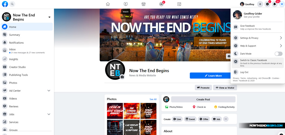
In the history of Facebook, there have been four major redesigns. The latest one, FB5, otherwise known as The New Facebook, might be the most dramatic of them all. It's a total shift in how Facebook looks and works on desktop and mobile.
While doing routine maintenance on my computer today, I cleaned out all my cookies and web cache, logged out of everything and then restarted. Truly I was not prepared for what awaited me when I logged back into Facebook, the site (pun intended) that greeted my eyes was something akin to digital snow blindness. It was very bright and very white, for a moment or two I was truly baffled. Then I remembered that this was the all-new Facebook interface design that finally got rolled out. And yes, it comes with Dark Mode if white is not your favorite flavor.
Being a long-term user of the platform, I can well recall other major updates like the news feed in the home section, and various others that at first I didn't like but then came to appreciate. I have a feeling that it's going to be the same with FB5, I am not used to the cleanness of it certainly, but as someone who has spent 20 years in UI/UX design, almost instantly it began to grow on me. Maybe this is just the diversion people need to get their mind off of the coronavirus pandemonium, if even just for a short time.
If you are not seeing the new look of FB5 on your desktop Facebook page, do what I did. Clean out all cookies and cache from your web browser, log out and then log back in again and you should see it. Please comment below how you do or do not like it.
The New Facebook FB5 update: How the all-new design looks and works
FROM POCKET LINT: Don't have a meltdown. It's been many years since a massive design change came to Facebook, so this news is both welcomed and much-needed, even if it's jarring. To help you navigate the change, we're breaking down what to expect.
What is The New Facebook?
At the F8 2019 conference, Facebook executives announced the social network plans to push out a massive redesign called The New Facebook. It's an interface update that will place a bigger emphasis on Groups and Events - two of the biggest reasons people visit Facebook on a daily basis. This subsequently also means that the News Feed will be featured way less in The New Facebook.
Both the desktop website and the mobile app will automatically receive the update, hopefully making Facebook easier to navigate while also modernizing its look for the new decade. Facebook described it as a cleaner design, with more of an all-white look and even a dark mode option.
When will The New Facebook arrive?
Facebook originally promised the redesign would begin immediately rolling out to mobile users, with desktop users to follow later.
As of January 2020, the update for desktop users is missing in action. But, according to
CNET, Facebook has finally begun giving some users access to the new look on the web. Facebook itself has confirmed it plans to offer the update "more broadly" by spring 2020.
It's already rolling out to mobile users. To get it, make sure you're running the latest version of the
Facebook mobile app.
No comments:
Post a Comment